This post sponsored by StageLightCompany.com, a professional lighting company for churches.
This article from Steven Hall is all about the way colors and color combinations affect our emotions and the environments we create in our church services.
Lighting can convey emotion, mood, setting, energy, and many other important elements during a church service. Color can be one of the most impacting attributes of lighting. Warm colors (red, amber, yellow) can convey intimacy, warmth, energy… while cool colors (blue, green, purple) can convey darkness, growth, majesty… Even further than that, a saturated color can convey depth and intensity, while a pastel can convey gentleness and calmness. Our use of color in worship can cultivate a climate where people connect deeper with God.
Check out this great list of some of the emotions that can be conveyed with color (awesome info from Camron Ware).
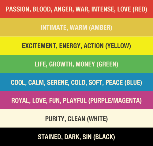
As you can see, a single color can communicate a lot in your design. But combinations of color can further steer the environment.
Color Combinations
A stage that is lit all red can look very oppressive. But if you add some magenta to the red, you will get a playful and energetic look. Or add purple to the red and get a more intense feel.
Adding similar shades normally works well. Red and amber, blue and teal, and magenta and purple are all great color combinations from similar hues.
Some color combinations don’t work well, though. A great example of an awful color combination is red and green. Although this color combination is culturally acceptable at Christmas, it still makes me cringe on the inside.
Many times, a pair of colors will work remarkably during most of a worship song, but lack enough energy during a build or chorus. Using a small amount of white as an accent can also help you fabricate interest and energy in these areas.
Limiting Colors
Trying to limit your colors within looks can give you a superb starting point. I use two colors + white as my theoretical color limit per look.
Many people fall into the trap of using lots of colors at the same time when lighting an element during a service. Occasionally, multiple colors can be impactful when used well and deliberately. However a lot of the time these collections of colors turn into visual noise. Using lots of colors seldom communicates any of the feeling you are trying to convey. A mix of red, magenta, amber, and yellow could be used to try and communicate intensity, playfulness, energy, and warmth during a loud call to worship song. A lot of times though, it just appears as white light near the stage with so many of the colors mixing. Instead, experiment with the two feelings you want most to convey. A mix of red and yellow lights can convey energy and intensity clearly.
As with any design element though, there is always an exception to the rule. A few moments do occur when I forgo my two-color rule. To simulate a sunset look during a song I have used a gradient of color, fading from amber on one side to a deep purple on the other. By using a gradient, there were many shades of very similar colors on the stage.
The vital consideration here is to keep the look from overwhelming the stage with too many colors in each area.
Color Positioning
Another way to add visual interest and convey your desired message is through the use of color positioning. Although a look with red and blue backlights may look good on stage, try to use one color as only sidelight. A blue backlight with a red side light creates deep and drastic shadows that will convey a sense of deep intensity that will work great in songs that are somber or heavy.
Color is complex and the combinations are endless. Some will look stellar and some will look atrocious.
There are too many color combinations to adequately go over all the variables in one article. Luckily we each have the most visually complex capture mechanism ever created—our eyesight. Trust your eyes and experiment with colors, color combinations, and positioning.
Start with a few color combinations from below then explore and experiment with what looks good and what doesn’t.
Teal / Incandescent White
Amber / Yellow
Blue / Amber
Green / Teal
Incandescent White / Purple
Additional Resources:
http://banditdimmerbeach.blogspot.com/2014/02/the-colors-children-colors.html
http://isquint.net/2010/rgb-vs-cmy-color-values/
Steven Hall is the Lighting Director at JourneyChurch.tv in Norman, OK.


This is similar in concept to any kind of design, where you have to be careful about mixing too many elements — like fonts on a brochure or web page, for instance. The exception, as you point out, is where you’re carefully considering why you’re doing it and you can see that it works. In a church setting, where you have a generally supportive audience that WANTS to improve something like lighting for their own improved church experience, you can get constructive feedback so there’s room for experiments. But this is a good overview on the topic — we know that fast food restaurants have used red / orange / yellow for years to get people eating more quickly. Why not use colors for other, perhaps more constructive, ends?
going to need you to stop referring to Black as evil or dark as sin, what do you think that makes a whole race of people feel like. Oh yes but White is PURE!! REALLY?????
This makes me sad that you thought of skin color when reading this list. Truly, black skin doesn’t make someone less pure than if they had white skin, nor vice versa. Just like if someone had purple skin, I wouldn’t think they were royal. I’d call medical help for them.
It makes me so sad that every time you hear the word Black it is associated with dirty, dark, evil, sinful and when you hear the word White it is always associates with pure, good, perfect, clean. Just something to make you say Hmmmmmmmmmm!!! Food for thought
You are right
Sidebar – just to let you know I think your blog is fantastic!
Thanks! And I hear what you’re saying. To be honest I’m not sure I could relate to the negative feelings that sort of thing must evoke. I look forward to a day where the sort of thing would be a complete non-issue…when justice and love reign supreme. One day, whether on this earth or the new earth. :)
My skin is not white, and yours is not black. So let’s stop being silly about all of this.
Silly to who. Real issues are always silly to those that don’t deal with them.
Laurie please deal with this issue that you have. The Bible talks about being washed clean white as snow doesn’t say white as skin. Bible also talks about darkness and light doesn’t say anything about the black race. Please do not try to start a fire
Jacob. like i said “Silly” to who. Its so funny how certain people don’t want to deal with real issues because the conversation would shine a light on your deep seeded issues that you claim you do not have. Real communication, understanding another’s point of view without considering it silly is how we will work together to heal the hurt that is plaguing our country. First understanding that everyone is not sitting on your ivory hills vantage point.
This is really interesting. Colour does evoke emotional s and the way we describe colour does have an impact. I’m white ( but as I told my mum when I was small, why am I called white when I’m not really white more of a yellowish redish cre colour) but om white by popular definition and my daughter is dual heritage and describes her skin as golden. We’ve tried really hard to help her feel that her colour is aomething to be proud of not segregated because of. Most of our friends are black or white. But the way we describe color does have impact. Let’s not trash what our brother is saying – if we listen we may hear enough truth to help us grow and understand how the words we use matter. Coloured lighting is powerful – black can convey many thing s such as night sky, the vastness of space, eternity, mystery, etc etc. And white can be icy cold snowy inhospitable environments. Isn’t it about how we use it?
This is really interesting. Colour does evoke emotional s and the way we describe colour does have an impact. I’m white ( but as I told my mum when I was small, why am I called white when I’m not really white more of a yellowish redish cre colour) but om white by popular definition and my daughter is dual heritage and describes her skin as golden. We’ve tried really hard to help her feel that her colour is aomething to be proud of not segregated because of. Most of our friends are black or white. But the way we describe color does have impact. Let’s not trash what our brother is saying – if we listen we may hear enough truth to help us grow and understand how the words we use matter. Coloured lighting is powerful – black can convey many thing s such as night sky, the vastness of space, eternity, mystery, etc etc. And white can be icy cold snowy inhospitable environments. Isn’t it about how we use it?
Why would any Christian have any desire to manipulate their congregations’ emotions? The truth of the Gospel doesn’t need this. If you think it does, you have a sub-biblical view of God.
I seem to remember from school being told that black & white are not considered colours.
Also, humans are all melonin coloured. We’re just different shades.